Eqalis
Eqalis speaks to two key principals, the first being that cannabis is a medical product facilitating the body’s natural systems to achieve equilibrium. The second principle derives from the value of a medicine in determining the quality of life it produces.

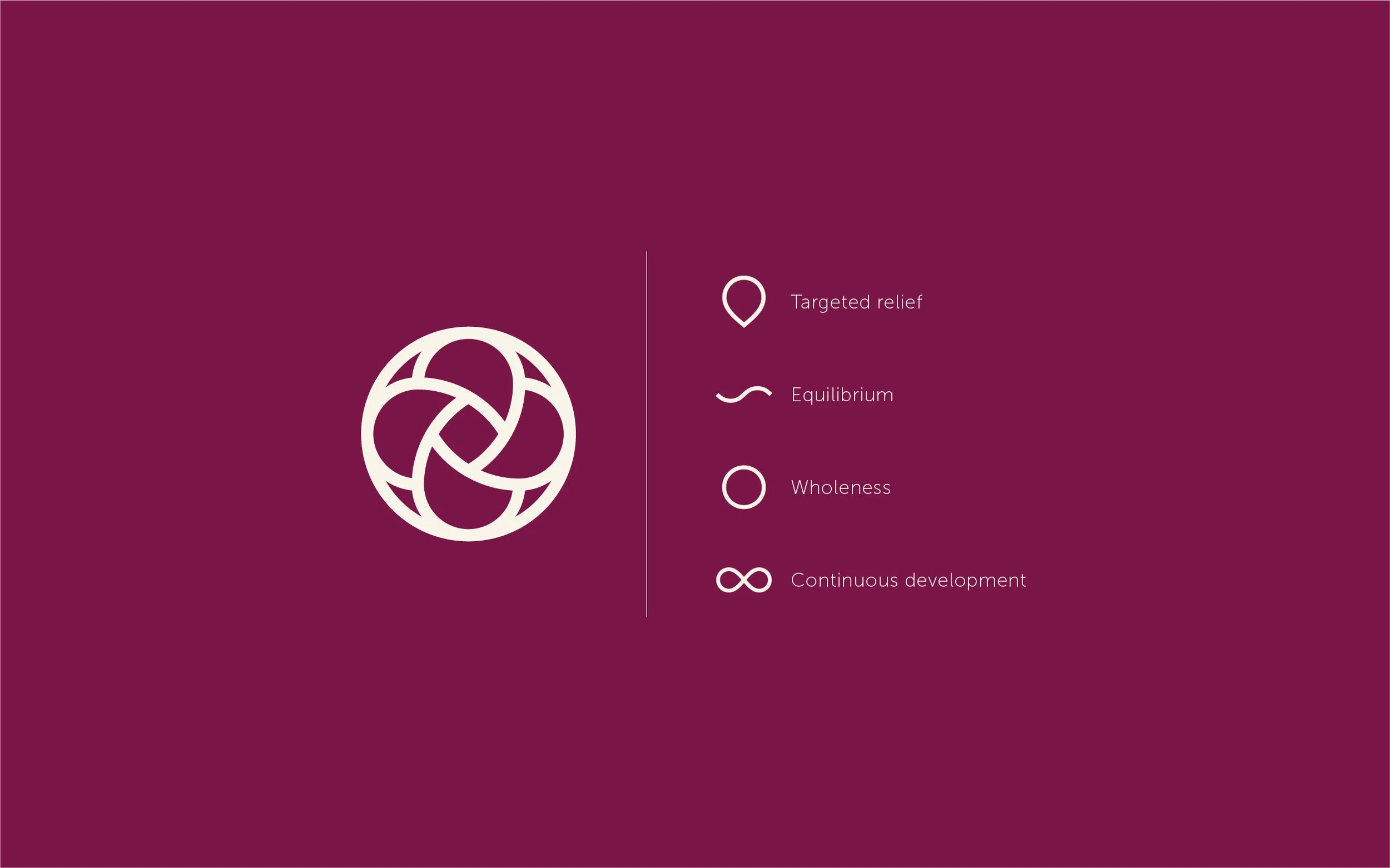
Eqalis is defined by the Statera icon, which speaks to the brand ethos of rebalancing your body and improving quality of life. It symbolises balance, wholeness, symmetry, targeted relief, and continuous development, with the suggestion of a flower eluding to New Zealand’s horticultural heritage.
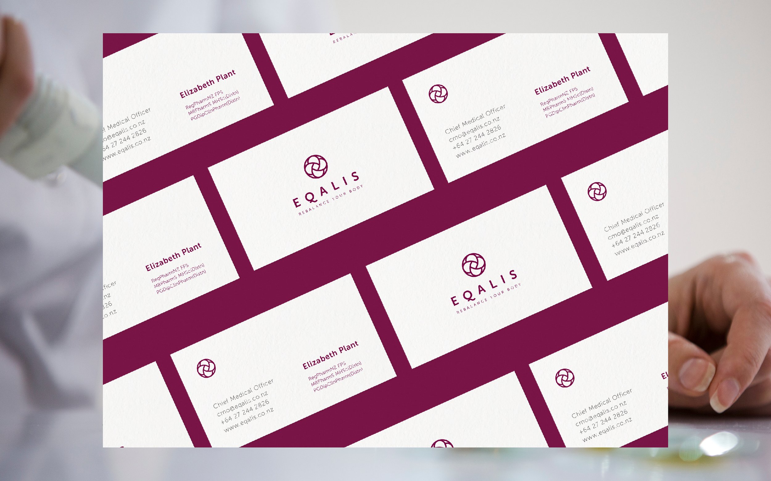
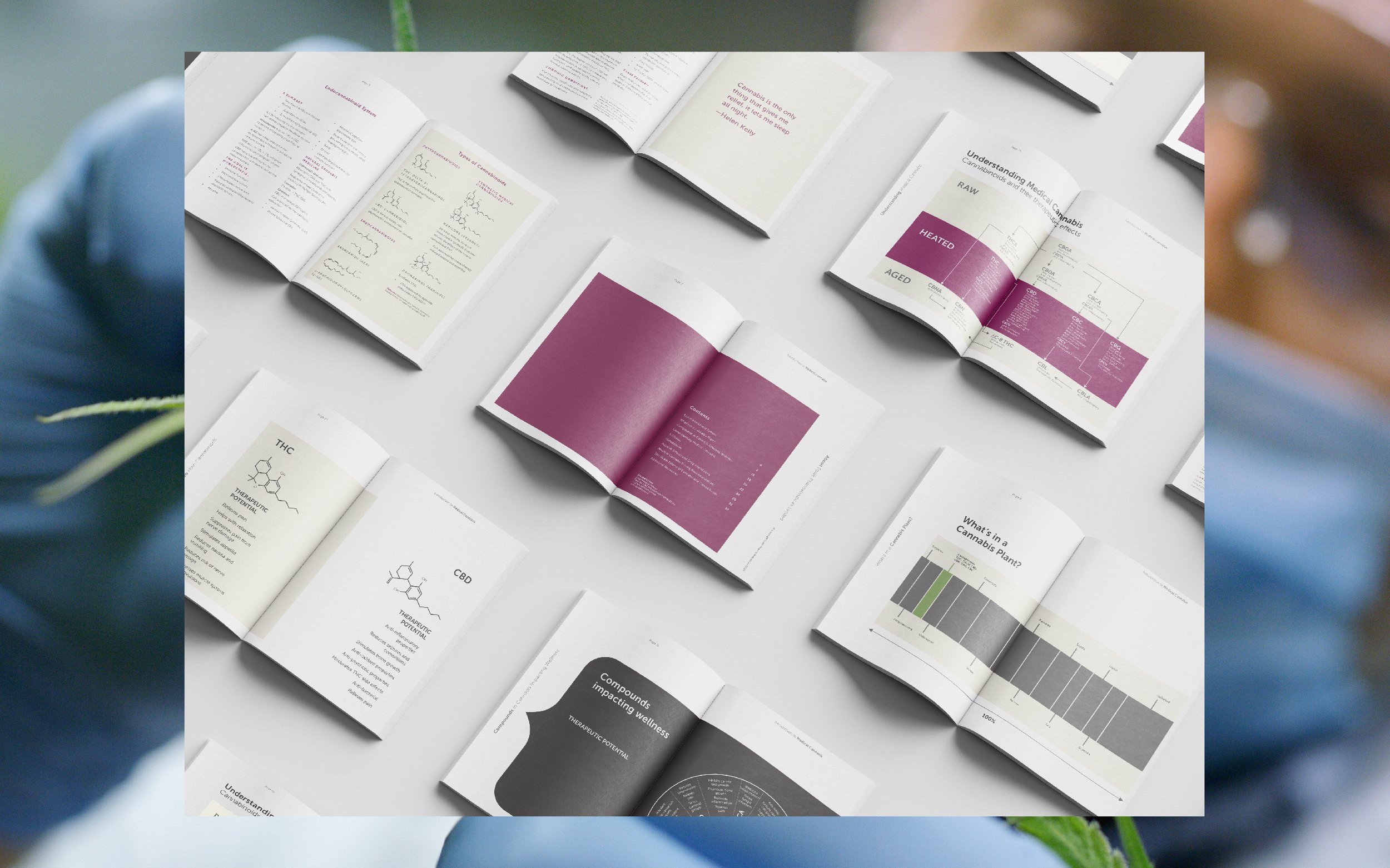
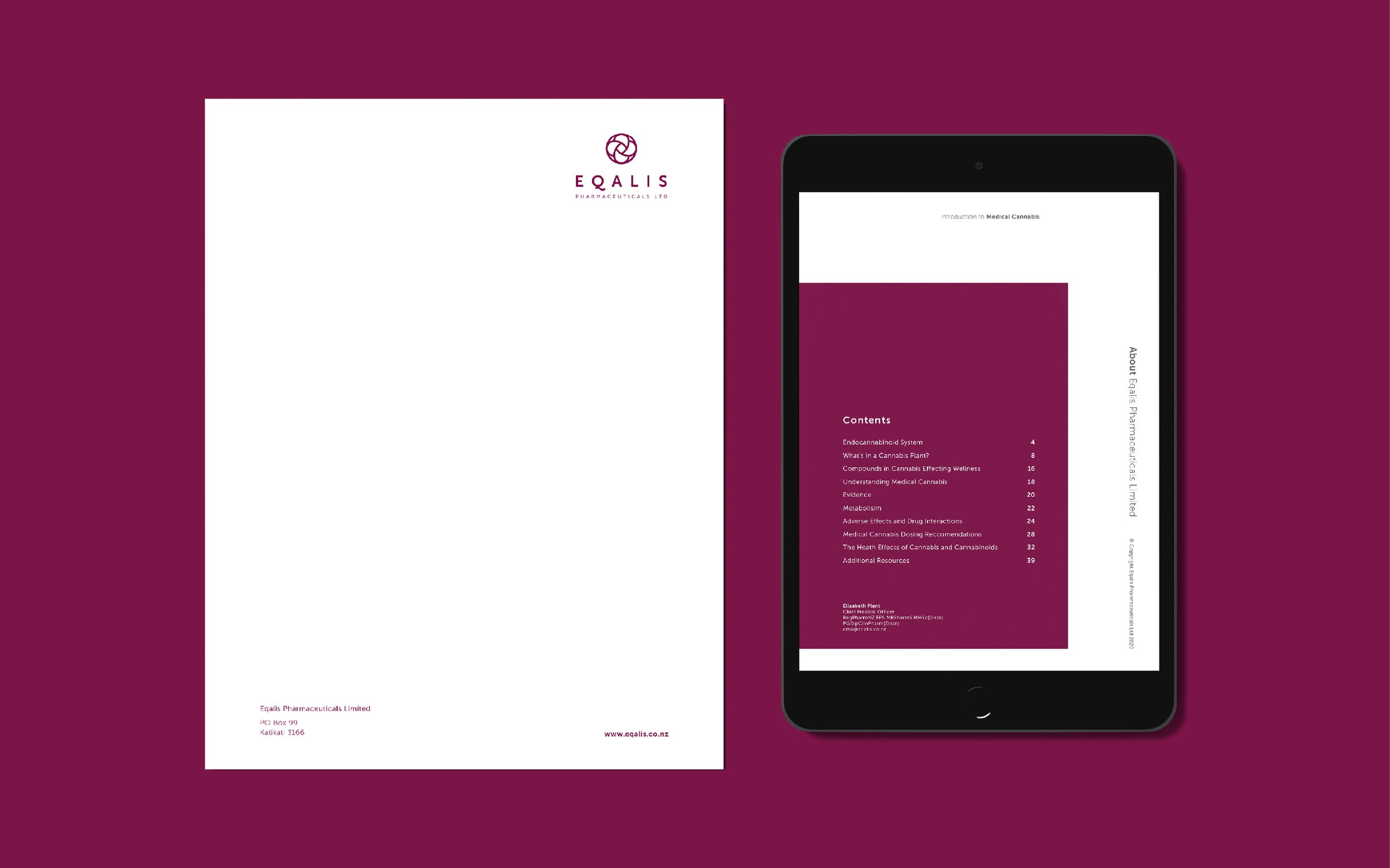

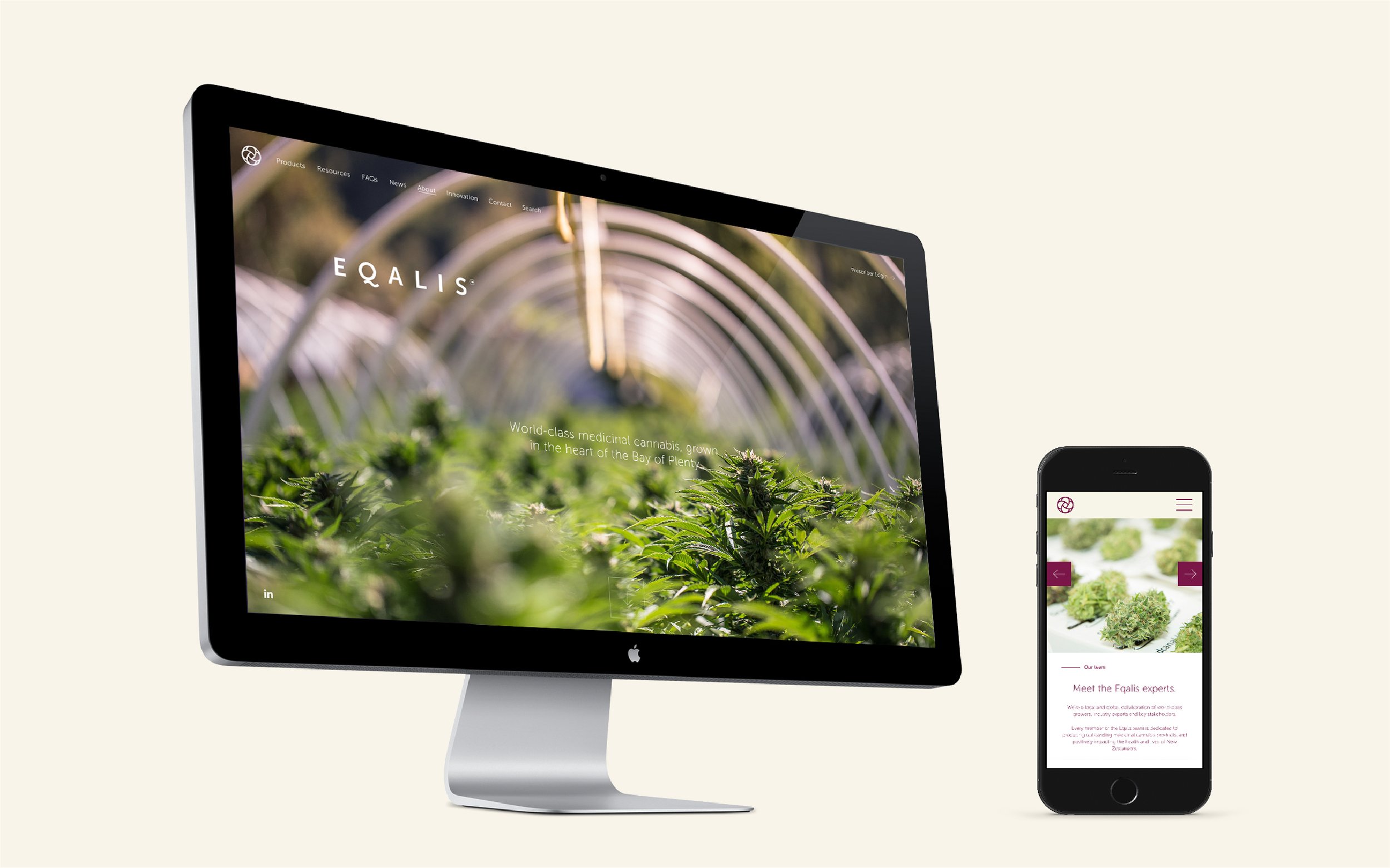
Pending government legislation, Eqalis will be manufacturing the highest quality medical cannabis oils for the New Zealand market. To bridge the gap of perceptions around cannabis use, a conservative yet refined identity was established to appeal to doctors, pharmacists, and medical professionals alike, executed through a minimal aesthetic and a logo rich with meaning.
Logo design
Brand identity
Print collateral design
Packaging design
Web design
Project completed in 2019 under the guidance of Fuel Agency.
