The Power of Fonts: More Than Just Letterforms
Think of typefaces like the secret sauce of design, the unsung hero that makes or breaks a brand’s identity. Selecting one isn’t based on which is the coolest, or even the latest and greatest—they’re selected based on their personality (yes, really) as a way to support a brand’s goals with the ability to whisper subtle messages into the minds of everyone who sees them. So, why does font choice matter so much? Let’s break it down.
Fonts Have Feelings: Typeface Categories
A typeface is defined as “a collection of characters that share distinctive design features, such as specific patterns in their shape, width, spacing, height, angles, or serifs” and can be split into four key categories:
Serifs: The Fancy Grandparents of Fonts – Think Times New Roman or Garamond. These fonts are the wise, sophisticated types that bring tradition, authority, and a sprinkle of old-school charm. Perfect for law firms, luxury brands, and anywhere you want to evoke trust.

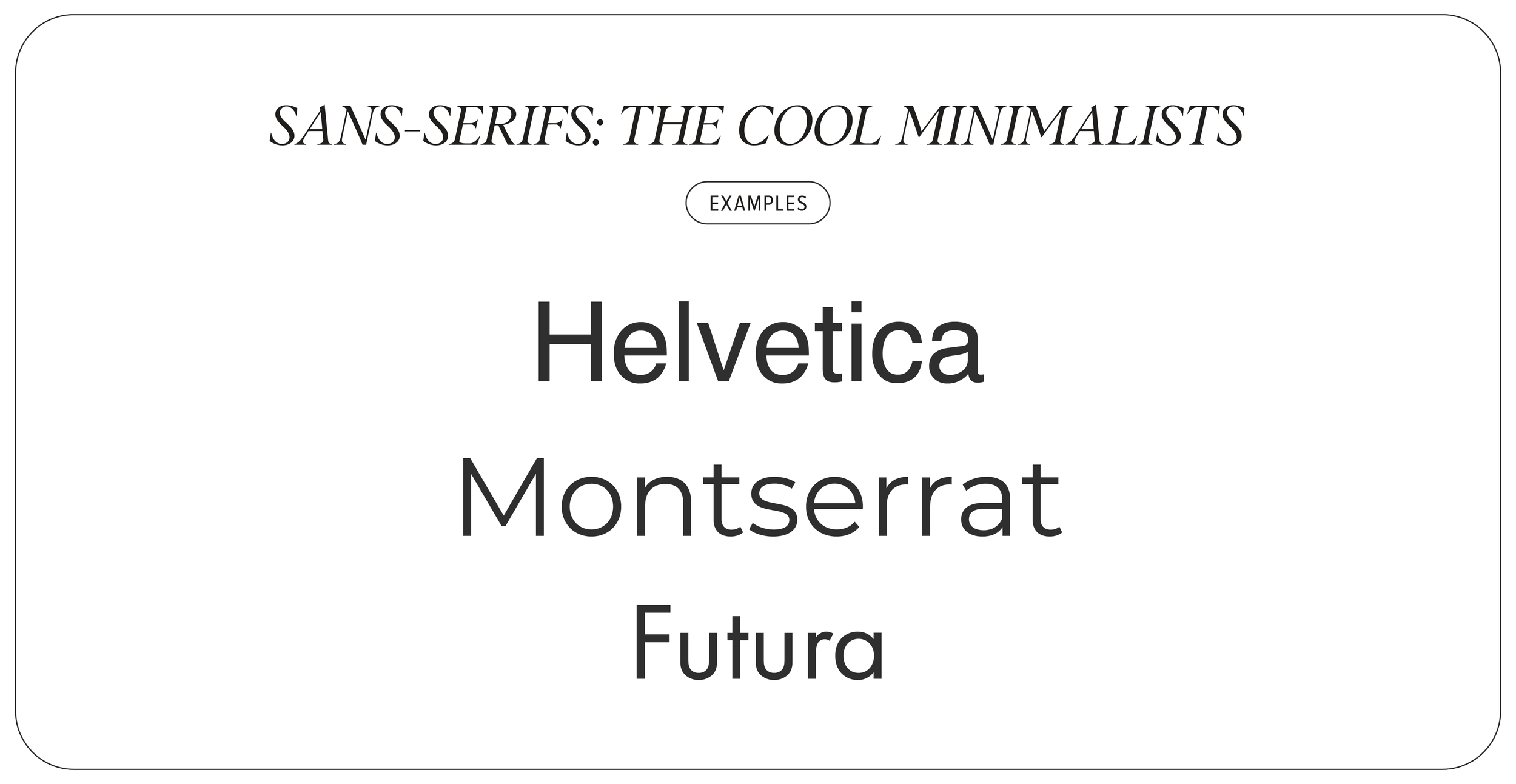
Sans-Serifs: The Cool Minimalists – Clean, crisp, and always on-trend, with Helvetica—deemed the best font ever made—being the epitome of this category. These modern fonts scream “we totally know what we’re doing” while being super versatile; ideal for startups, fashion brands, and corporate identities that want to feel fresh.
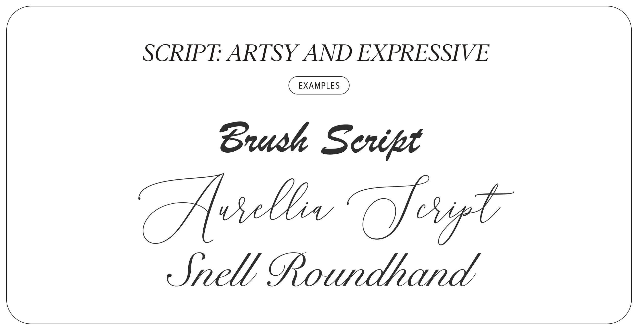
Script Fonts: Artsy and Expressive – Whether it’s fancy calligraphy or a relaxed and relatable handwritten style, script fonts bring personality, warmth, and creativity. Great for wedding invitations, boutique brands, and anything that needs to feel elegant.
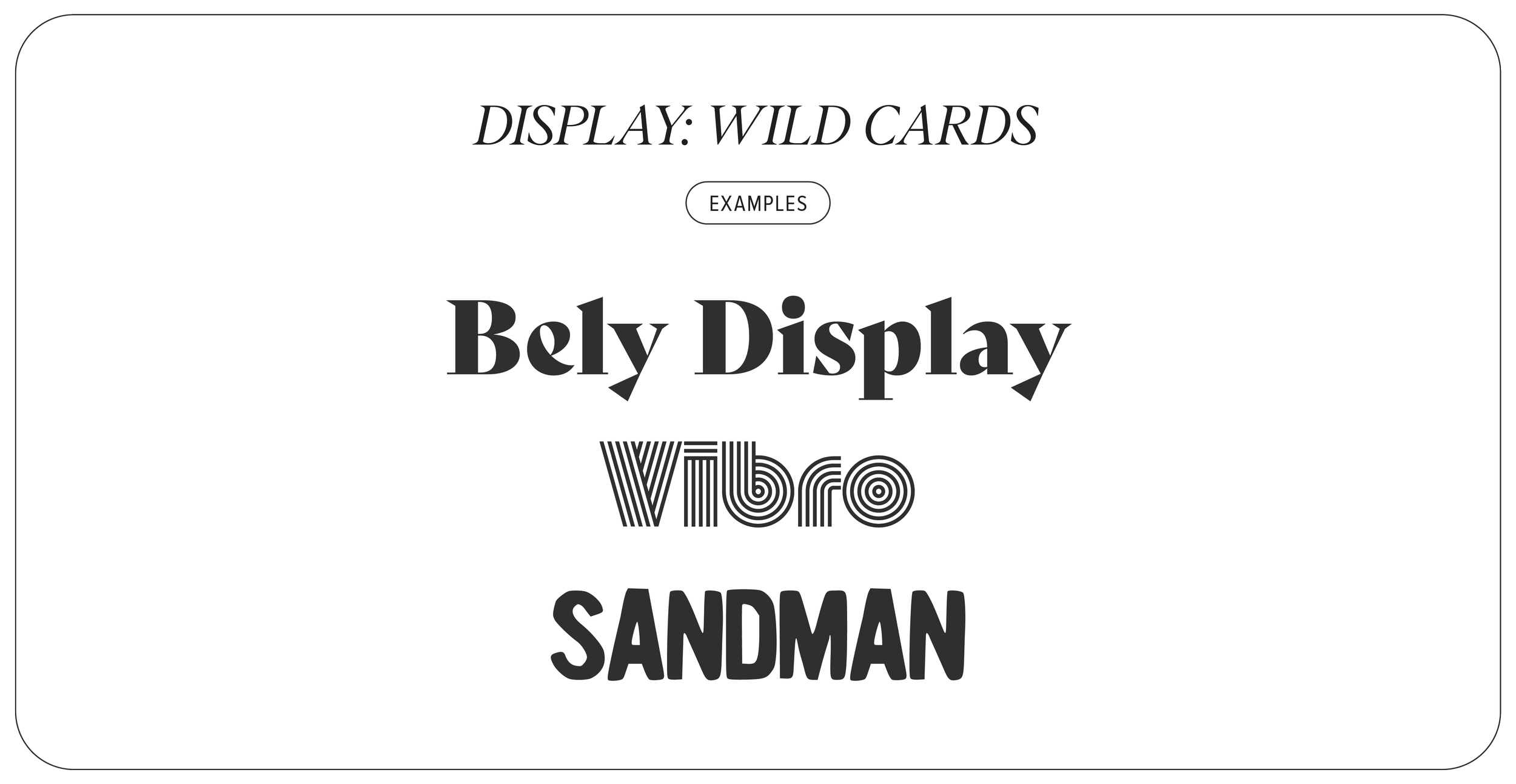
Display Fonts: The Wild Cards – Quirky, bold, and full of personality, display fonts love attention. Think of them like the extroverts of the font realm. They’re perfect for logos and headlines but beware—too much and it’s like an over-the-top party guest that’s overstayed their welcome.
The Importance of Choosing the Right Font for Branding
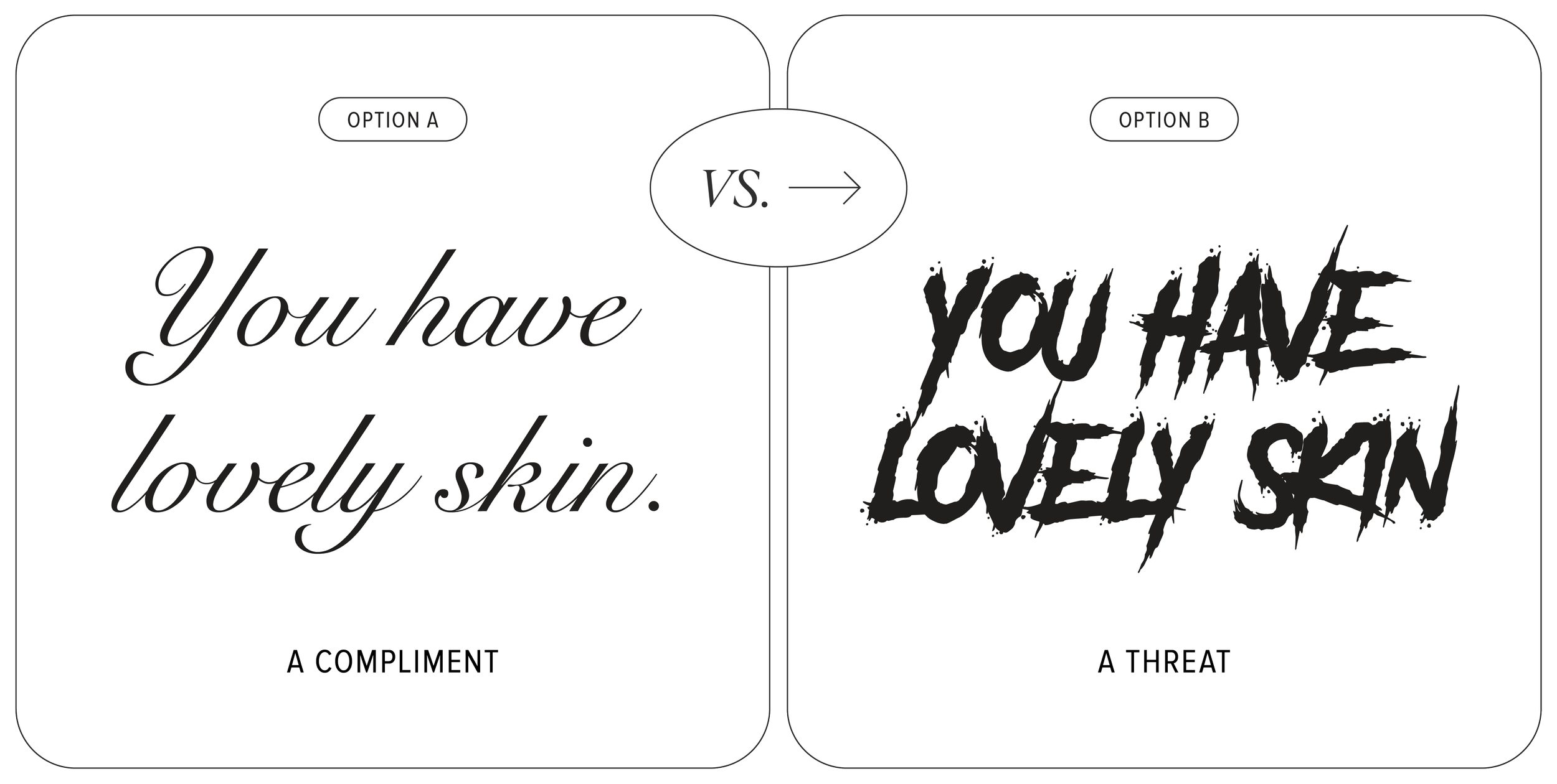
First Impressions Are Everything – Your font selection sets the mood before a single word is read. A sleek sans-serif? Modern and professional. A bubbly handwritten font? Fun and approachable. Choose wisely!
Check out this example (view an in-depth version on our Instagram) that compares how the same statement feels depending on the font used:
Brand Consistency = Trust – Sticking to a solid font family across all branding materials creates strong brand recognition. Coca-Cola’s script is iconic, and Google’s sans-serif logomark is instantly recognisable.
Readability is Non-Negotiable – Sure, that ultra-fancy font looks amazing, but if no one can read it, what’s the point? Striking a balance between style and clarity is key, with some typefaces specifically optimised for accessibility.
Fonts Pack an Emotional Punch – A handwritten script might feel warm and friendly, while a sharp geometric font can feel sleek but distant. Choose a typeface that speaks your brand’s language.
Final Takeaway: Your Brand’s Secret Weapon
The purpose of a font isn’t just to communicate written messages—they have the ability to tell stories, evoke emotions, and shape identities. Being able to select the right font family is a bit like having a superpower in a creative toolkit, so next time you’re picking a typeface, remember: you’re crafting a brand’s voice, not picking the font you like the most.
Keen to nerd out about type together? Need help selecting the right typeface for your brand? Let’s connect.